top of page

Hey Peppers! is a group of schools with numerous units in the southern region of the country, which decided to expand its operations through a brand that would focus 100% on distance learning. Our challenge was to create a cheerful and contemporary brand and its entire visual universe, behavior and especially positioning.
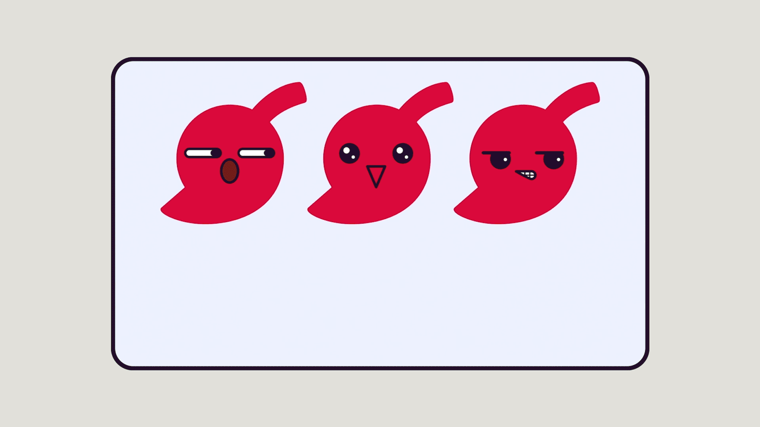
We started from the pepper, which is the symbol of the Hey Peppers group, to create something that, at the same time that it belongs, also differentiates itself. We also developed a super colorful and youthful visual universe, exploring various elements that derive from the brand, creating a more spontaneous and proprietary language.
PEPPERS!
POSITIONING,
VISUAL IDENTITY
AND BRAND DESIGN


bottom of page